Final Product What You'll Be Creating
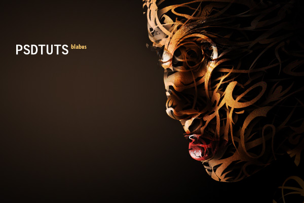
This
tutorial will demonstrate how to take an image, in this case a woman’s
face, and give the appearance that it is entirely composed of vector
shapes. Along the way, we’ll use some fairly basic techniques, including
clipping masks and displacement maps, to achieve a unique effect!

I chose an image size of 720 x 480 pixels at a resolution of 300 pixels per inch.
Once you’ve created your new image, fill the background layer with solid black.

You can use an image of almost anything for this effect, but to follow this tutorial, your best bet is to choose an image similar to mine, i.e. a human face.
Once you have your image, place it into your document as a new layer. Remove everything else in the picture, just leaving the face. I’ve also adjusted the brightness and saturation on my image. You can preserve the entire person’s head, but I personally think the effect looks better with the back of the head being cut off, leaving just the face.


Now we need our vector shapes, which will ultimately combine to actually form the woman’s face, or whatever image you chose. I used quite a few different shapes from GoMedia’s Arsenal Vector Sets 2 [Hooladanders] and 3 [Hooladanders 2]. You have to pay for them, but if you’d just like to try out the effect, a couple of shapes in the free Vector Pack Sample should work.
Once you have your shapes, start dragging a few into your Photoshop document. If it asks you how to paste them, choose Smart Object. How you place your objects here will greatly affect the end result. You may be tempted to just throw the shapes on any which way over your image, but you should take care to make sure they flow with the the contours of the image. This doesn’t have to be perfect as some adjustments will be made later, but just randomly placed objects will not produce as good an effect. Notice how in my image, all of the vector shapes not only flow with the contour of the woman’s face, but also flow in the same general direction relative to each other. Their weight is also distributed toward the front of the face, with the tails of the shapes trailing toward the back of the head. Remember, we want it to look as though these vector shapes are all gathering together and combining to form the image.
Also important to take into consideration is the number of shapes you lay over your image. While it may seem like adding more shapes will produce a more complex and intricate look, it will actually take away from the desired effect because almost the entire original image will be visible. We want to be able to see the black background through different areas between the shapes.

For
anyone unfamiliar with this feature, displacement mapping takes an
object or layer, in our case a vector shape, and using another image
file (a displacement map), transforms the image so that it would fit
over the map. It determines this by the color of each pixel in the
displacement map, with lighter pixels corresponding to what would be a
higher area on a 3D model of the image. The reason we copied the
original image of the woman’s face and desaturated it was to allow for
an easier mapping by eliminating colors. We also blurred the image
because displacement mapping in Photoshop is very accurate. If we had
tried it on the original image, our vector shapes would appear choppy
because in reality they were mapped to the smallest bumps and textures
on the woman’s skin. Blurring the image slightly leaves only the smooth
contours of the woman’s face, allowing for our vector shapes to maintain
their smoothness but still conform to the face.


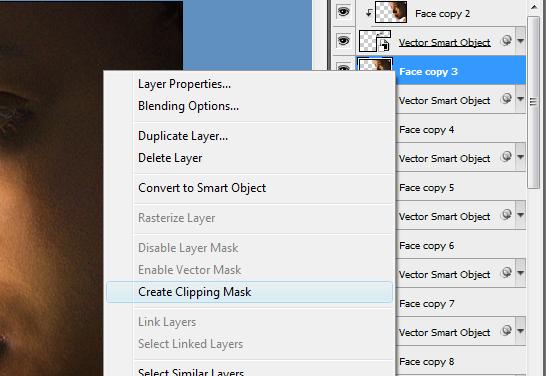
Once you’ve got a shadow effect that looks good, right-click on that vector shape layer and select Copy Layer Style. Then, right-click all of the other vector shape layers and select Paste Layer Style.

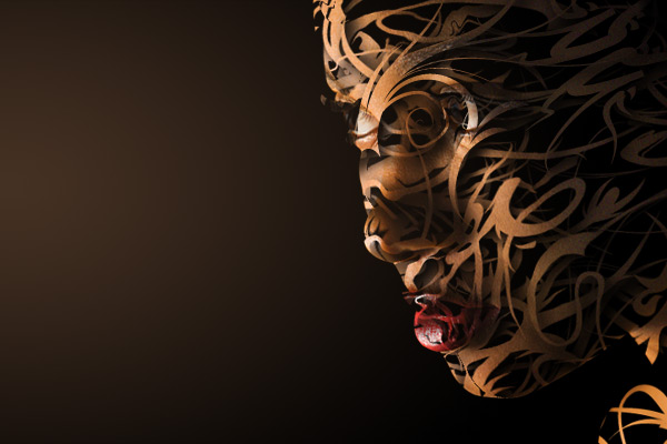
This technique can be applied to any image using any vector shapes. The key to making it look convincing is matching the vector objects to the shape, contours, and flow of the object image they’re to be wrapped around. It’s an odd effect, but I hope you were able to gain something from this tutorial, and good luck with your own work!


Step 1
To begin, create a new document of pretty much whatever size you’d like. I personally prefer a wider look for this effect, but any size should work. You should, however, probably stick to a landscape aspect ratio, at least for following this tutorial.I chose an image size of 720 x 480 pixels at a resolution of 300 pixels per inch.
Once you’ve created your new image, fill the background layer with solid black.

Step 2
Next, we have to find an image to work with. I chose a picture of a woman’s face that I found on the stock photography Web site stock.xchng, however, the owner of the photo requested that I credit the Web site iofoto.com, so I’ve just put both here.You can use an image of almost anything for this effect, but to follow this tutorial, your best bet is to choose an image similar to mine, i.e. a human face.
Once you have your image, place it into your document as a new layer. Remove everything else in the picture, just leaving the face. I’ve also adjusted the brightness and saturation on my image. You can preserve the entire person’s head, but I personally think the effect looks better with the back of the head being cut off, leaving just the face.

Step 3
Duplicate the face layer and make sure it’s positioned exactly on top of the original face. Press Shift + Control + U to desaturate the layer and then go to Filter > Blur > Lens Blur. Make sure the setting for Source is selected as Transparency, and use settings of 10, 0 and 0 for Radius, Blade Curvature, and Rotation, respectively. We’ll see later on why blurring this layer is necessary.
Step 4
Before we go any further, we need to save our document again, under a different name. So make sure the top, blurred layer is visible and save your document as “dispmap,” or whatever you want to call it. This file will be used as our displacement map later on.Now we need our vector shapes, which will ultimately combine to actually form the woman’s face, or whatever image you chose. I used quite a few different shapes from GoMedia’s Arsenal Vector Sets 2 [Hooladanders] and 3 [Hooladanders 2]. You have to pay for them, but if you’d just like to try out the effect, a couple of shapes in the free Vector Pack Sample should work.
Once you have your shapes, start dragging a few into your Photoshop document. If it asks you how to paste them, choose Smart Object. How you place your objects here will greatly affect the end result. You may be tempted to just throw the shapes on any which way over your image, but you should take care to make sure they flow with the the contours of the image. This doesn’t have to be perfect as some adjustments will be made later, but just randomly placed objects will not produce as good an effect. Notice how in my image, all of the vector shapes not only flow with the contour of the woman’s face, but also flow in the same general direction relative to each other. Their weight is also distributed toward the front of the face, with the tails of the shapes trailing toward the back of the head. Remember, we want it to look as though these vector shapes are all gathering together and combining to form the image.
Also important to take into consideration is the number of shapes you lay over your image. While it may seem like adding more shapes will produce a more complex and intricate look, it will actually take away from the desired effect because almost the entire original image will be visible. We want to be able to see the black background through different areas between the shapes.

Step 5
Now, select your first vector shape layer, and go to Filter > Distort > Displace. Leave the Horizontal and Vertical Scale values at 10, and select the Stretch to Fit and Repeat Edge Pixels options and click OK. When the file dialog appears, select the file you saved earlier as “dispmap” (or whatever you called it) and click Open.
Step 6
Once you have used the displacement mapping on all of your vector shapes, you need to then duplicate your original image layer as many times as the number of shapes you have. What we need is a copy of the original image for every vector shape we have, with the copy on top of its shape in the layers palette. When you’re finished arranging everything, you will have alternating image and vector shape layers, starting at the top with an image layer.
Step 7
We now need to create the clipping masks that will transfer our original image into the vector shapes. So for each copy of the image layer in the layers palatte, right-click it and select Create Clipping Mask. Don’t worry if no visible changes occur; you won’t see them until you make the very last clipping mask. You can tell if you’ve made the mask successfully if there is a small arrow pointing down in the image layer and the vector shape layer below it is underlined.
Step 8
Once you have made all of the clipping masks, you should begin to see the final image take shape. However, we’re not done just yet. Now select the topmost vector shape layer and add a Drop Shadow to it. I used an angle of 140 degrees, and settings of 10, 10 and 20 for Distance, Spread and Size, respectively.Once you’ve got a shadow effect that looks good, right-click on that vector shape layer and select Copy Layer Style. Then, right-click all of the other vector shape layers and select Paste Layer Style.

Step 9
At this point, we’ve finished the final effect on the image. I added a Radial Gradient to the background to give the impression that light is coming from the left to match the general shading of the image.
Final Image
Finally, I have added some text and darkened the neck area so it sits further in the shadows. Additionally, I upped the contrast to make the image a little more eerie.This technique can be applied to any image using any vector shapes. The key to making it look convincing is matching the vector objects to the shape, contours, and flow of the object image they’re to be wrapped around. It’s an odd effect, but I hope you were able to gain something from this tutorial, and good luck with your own work!




0 comments
Post a Comment