Coldplay / Apple Style Portrait
This tutorial will show you how to create a portrait based on the style of the latest Coldplay / Apple Ad featuring “Viva la Vida” from Coldplay. In case you’re not familiar with the commericial I’m referring too, findthatsong has uploaded a copy of it onto YouTube.Here’s a quick look at what we’re going to create:
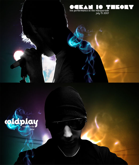
Before going any further, I’d like to give a quick shout out to Fabio who wrote an awesome tutorial for a similar effect based on the same ad. Maybe I’m not the only Coldplay fan out there!
Time to begin!
Step 1 – Create the Document
Begin with a document sized to your liking. I’m working at around 750x450px myself, but the exact size really doesn’t matter.What does matter is the background color though. Using the Paint Bucket Tool, fill your background layer with a dark (nearly black) green or blue (#010500).
Step 2 – Adding Light
Create a new Layer.Using a large, white, soft brush (500-1000px, 0% Hardness), paint the lower part of your image. The brush should basically extend from the very bottom of your canvas in all direction to the other edges of the canvas.
Lower the Opacity of your new layer to around 70%.

Step 3 – Coloring the Light
For this step, we’re going to be playing with a similar effect that I discussed in my Unique Abstract Website Header Photoshop Tutorial. Create a new Layer, and select a large (400-600px), soft, orange (#f38c11) brush. Paint a large dab to fill the bottom right of the canvas.Now select a light blue (#2afaf0) and paint in the bottom left of the canvas.
Finally, fill in the top center of the canvas with a shade of purple (#c94ce1).
Set this layer to Overlay.
Step 4 – Adding some Highlights
Create a new Layer.Using the Brush Tool, and a small (30-60px) soft, white brush, paint a few lines curving around the center of your canvas. Apply a Radial Blur (Filter > Blur Radial Blur), using the Spin blur method with an amount between 50-70. Set this layer to Overlay.
Step 5 – Insert Photo
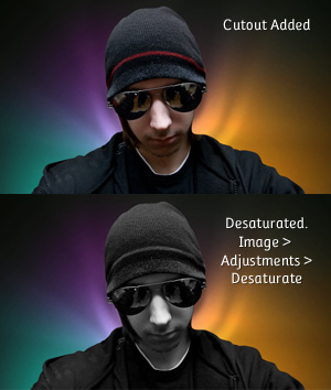
Time to add a photograph of our subject into the portrait. Going over the process of cutting out a subject is out of the scope of this tutorial, but I will suggest using the Pen Tool to prepare such a cutout.
When you have a cutout prepared, Paste it into a new layer in your document. Line it up so that the highlights seem to be coming from behind it.
Destaturate (Images > Adjustments > Desaturate) the cutout so that the subject is black and white on top of the colored light we created earlier.
Step 6 – Dodge and Burn
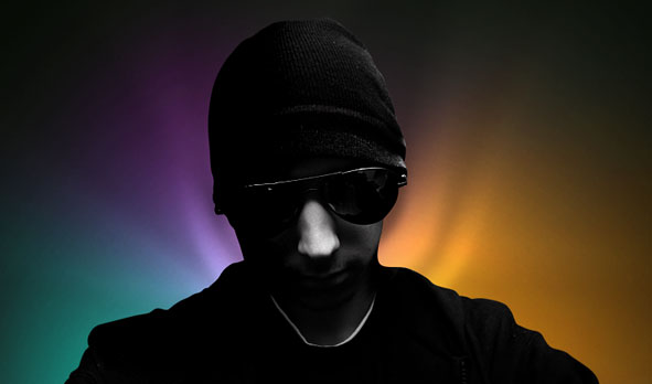
In the Coldplay / Apple commercial, the subjects are nearly silhouetted with the light bursting out from behind them. However, the photo I chose is pretty clear, as if there is a light source in front of the subject.If you have the similar problem on your image, you can fix it using the Dodge and Burn Tools.
Grab the Burn Tool (Located underneath the Paint Bucket Tool) from the toolbox, and in the Options Bar, set the Range to Shadows. Using a large, soft brush, paint over most of your subject to darken it. I’m going to leave a bit of the right side of my subject lit up to show that there is some light reflecting off of him.
You can go back with the Dodge Tool to bring out some brighter highlights if you find it helps light up part of your subject.

Step 7 – Adding the Smoke Effect
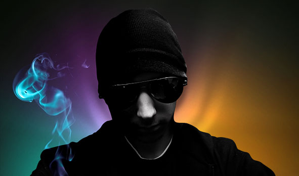
There are a few ways we could go about creating smoke in our design (We actually featured an interesting smoke effect in our May Tutorial Roundup), but in this tutorial we’re actually going to use a stock image.Download the “smoke” stock image from stock.xchng (Requires a free account).
Paste and Transform the smoke stock image so that it’s positioned and sized somewhere over your subject. Set the blending mode for this new layer to Screen.
Screen Blending Mode
Confused about what just happened? The Screen Blending Mode can be very handy sometimes, as any pixels that are black will essentially become transparent in the blended layer.Step 8 – Adjusting Smoke Color
Using any of the Selection Tools (Magic Wand Works Great), select the smoke from the stock image. Apply a feather to the selection (Select > Feather) of a 1-3px to soften things up.Create a new layer, and using the Paint Bucket Tool, fill your selection with a light blue/cyan (#28dff5). Set this layer to Color.
Step 9 – Enhancing the Background
Duplicate the Smoke layer (not the color, but the smoke layer – Layer > Duplicate Layer while selected), and move the new layer underneath your subject layer.Transform the new smoke layer so that it takes up a lot of the background behind your subject. Set this new layer to Color Dodge. You may wish to also apply a slight Guassian Blur to this layer.
Step 10 – Add Dark Lines
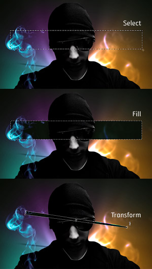
Create a new layer underneath your subject. Using the Rectangular Marquee Tool, make a long selection spanning about the width of your canvas.
Fill the Selection using the Paint Bucket Tool with a dark color (black will work fine).
Deselect your selection by going to Select > Deselect (Or Ctrl + D).
Now, Transform your black rectangle (using Free Transform, Scale, Rotate, Perspective, or any mix of those you are comfortable with). We want the side of the bar that is going to be underneath our image to be more narrow than the end coming out of our subject (similar to a sunburst effect).
Use the Move Tool to reposition your bar. Set the blending Mode to Overlay. You may consider fading your bar out like I did with a large, soft eraser.
Add a few more of these bars using the same technique.

Time for Polish
At this point, you’ve finished the effect we were aiming for! You don’t have to stop here of course. If you’re going to continue playing with the design, and adding your own finishing touches, here are a few suggestions that may get you started:- Add a Vignette – Fade out your borders to a dark black color. Since we’re designing a portrait in this tutorial, it’s a really nice way to frame your subject!
- Add some abstract dust – We’ve got a brilliant Photoshop tutorial for adding Abstract Dust and Spray Effects to designs like this which you may be interested in!
- Play with Text – Some clever text placement can really add a lot to a design! White text seems to look really great on top of this effect, especially if you’re using a blocky Type.
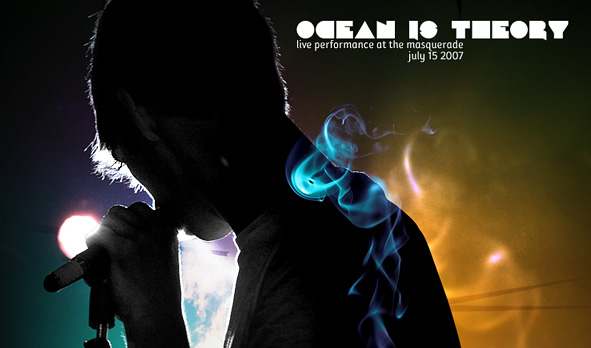
And here is another example of the style put to good use!


0 comments
Post a Comment